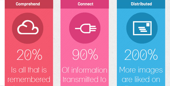
In a world where people demand instant access, visual information in the form of pictures and video communicate messages in a shorter time frame than text-based information. Do you find it easier to follow a story by reading a book (which will take days), or by watching the movie based on the book (which takes approximately 2 hours)?
As entrepreneurs, you know the importance of accessible business information. No matter if you’re researching marketplace trends or tracking metrics, access to the right information at the right time is often a primary component of good decision-making.
Visualizing your business data is often the best way to get this information. It opens up a range of possibilities, and this article will show you three reasons why.
Data Visualization Makes Information Easier to Understand
We live in a world where people rely on information being available quickly and easily. Just think of how dependent some people are on smartphones and laptops throughout the day. As an intrinsic design element of these devices, icons are displayed on screen, allowing instant access to documents, apps and software you need. This is a simple form of data visualization, but it serves as a great example of its effectiveness.
More and more, businesses are placing a larger emphasis on big data management. Often, they’ll collect reams and reams of data which could be a gold mine of useful information, but is often left at the wayside because people just can’t make sense of all the numbers. Visualizing data allows us to do this more easily. By arranging your data into a visual medium, you can spot patterns that would likely go unnoticed.
To illustrate my point, here’s a table of generic sales data.


Data Visualization Can Improve User Engagement
Skeptics of data visualization often believe that pretty pictures disguise real business issues, and are in fact style over substance. I assure you, while data visualization can result in this if used the wrong way, the ability for pictures to attract attention and maintain interest should not be dismissed.

Have you ever bought something for no reason other than the fact that it looked good? Chances are you have, and this shows how powerful appearance can be for grabbing attention. Though business data isn’t simple (i.e. relying on appearance with no substance is suicide), the principle can be used to draw people to important information.
For example, imagine that you have a meeting with stakeholders, and you have to present your business data as an indication of progress. If you were to present a selection of data tables, your audience would most likely lose track of the presentation due to most tables looking the same. Each new piece of information looks just like the last, and this will result in the impact of your presentation being diluted.
If however, you use graphs and charts of varying colors to display your data, it is far clearer when the subject has changed.

Using different types of charts will further add to your impact. After all, the brain is wired to detect changes in its environment, and visual indicators provide the most stimulation. Therefore, your audience is more likely to pay attention to pictures than text or numbers.
Data Visualization Reveals Hidden Opportunities
This is perhaps the most overlooked reason of the three, but also the one with most possibilities. As I mentioned before, one of the main reasons that tables of data fail to yield information is that they only offer one perspective on the data you’ve gathered, no matter how you rearrange your numbers.
But if you use data visualization in appropriate software, then you can easily arrange your data in multiple configurations, and therefore gain many different perspectives on one set of information.
Here lies the main problem with relying on numerical data alone. Often, decisions are only made based on numbers, without a thought towards what the numbers actually show. If you look at the data table examples above, you might (at a stretch) be able to compare one data value to the one that preceded it, and therefore get a small idea of progress. Data visualization allows you to be far more dynamic in your approach to analyzing data, allowing you to actually experiment with your data to find those hidden gems of information.

In summary, visual data can communicate information to people far quicker and easier than text and numbers. In this modern world we live in, visuals are overtaking written information as the most effective way to learn, which is emphasized by modern technology.
This ability to be easily understood is why visualizing business data is so important, as not only can it be assimilated easily and attract attention, but it can also reveal hidden opportunities in your data, making it a powerful tool. I urge you to try visualizing your business data using software (you can get free trials online quite easily), and open yourself up to the endless possibilities of data visualization. After all, a picture is worth a thousand words!
Rhys Morgan is currently Marketing Manager at Target Dashboard, which creates KPI dashboards designed for managers to see opportunities and check on the health of their organization. Passionate about technology and customer service, he maintains a blog which gives clear, jargon-light advice on data visualization and KPI management.
© YFS Magazine. All Rights Reserved. Copying prohibited. All material is protected by U.S. and international copyright laws. Unauthorized reproduction or distribution of this material is prohibited. Sharing of this material under Attribution-NonCommercial-NoDerivatives 4.0 International terms, listed here, is permitted.


