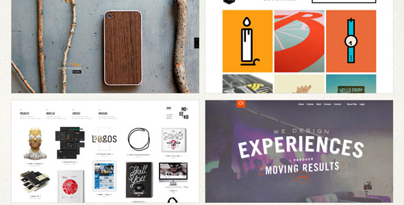
We have all seen certain company websites that look as though a cotton candy machine vomited all over their homepage. Everything seems to have been crammed into a very small space, company information is shoved into every corner, and there is just too much going on.
Not only are these types of small business websites unappealing, they are a turn-off for potential customers. A tell-tale sign that a company hired an amateur web designer is that there is too much “stuff” on their homepage. When it comes to web design (and your branding efforts), less is more.
Here are six quick tips on how to simplify your company’s website and make it more appealing to potential customers:
-
If something does not have a purpose, get rid of it.
One big rule of web design is that nothing on your company’s website should be accidental. Everything should have a purpose and function, just like a machine. Machines are never manufactured with unnecessary pieces; the same thinking should take precedence with your company website. If certain information does not fit with the rest of the page, it needs to go.
-
Web design elements should never compete for your attention.
When it comes to web design, there should only be one or two big design elements that call attention to themselves. For instance, think about a band. If there is a saxophone solo, the piano player should not attempt to take center stage. All of the other instruments should be supplementing the solo, not overpowering it. The same goes for a web design. There should be an attention-grabbing element and everything else on the page should be an accompaniment.
-
Stick to three fonts, tops.
Yes, there are a lot of cool fonts available to web designers. However, all of them do not belong on your company website. Think about how overwhelming that would be. Instead, simple fonts can make a statement and there are plenty of well-designed one-font websites. So do not be afraid to ask your web designer to use one font in varying weights and sizes. This design strategy can be anything but boring. Just because you can use three fonts does not mean that you should. There are few websites that can pull off the three-font layout. If you feel that one font is too bland, stick to two fonts.
-
Use a maximum of three or four colors.
Acclaimed painter Bob Ross was an expert at making hundreds of colors blend together in the perfect combination of beauty and tranquility. Chances are you (or your web designer) are not Bob Ross; so it is best not to follow his example when it comes to color. Instead, sticking to three or four colors can simplify a website and make the layout more visually appealing. For example, one great tactic is to go monochromatic and use the same color in different shades. Also, using lighter colors for a background, such as white or pastels, can make your company website feel more open.
-
When it comes to content, small blocks of text are great.
Do you remember when your college professors taught you how to write those lengthy 50-page essays? Thankfully this type of content has no place on your company website. Not only is lengthy content without visual breaks a bore to read, it is visually unappealing to potential customers. Instead a majority of your content belongs on your company blog. For the rest of your business website stick to a paragraph or two at most. If you can make your point in two or three sentences, even better.
-
White space can be a wonderful thing.
Don’t feel pressured to use every spare inch of your company website. Clean lines and minimal content can be a good thing. Take a cue from art at your local modern art museum. Chances are, the art is very minimalistic and features simple shapes and colors. Some works of art might not even have paint on certain parts of the canvas. While some art might not make perfect sense to some, there is a reason why art enthusiasts pay to view it. In the same way, cluttered websites can seem chaotic and make people feel anxious or disorganized. In contrast, clean websites can appear more relaxed and inviting (and improve conversions) if designed correctly.
For more information on website design trends and website design examples visit The Best Designs.
© YFS Magazine. All Rights Reserved. Copying prohibited. All material is protected by U.S. and international copyright laws. Unauthorized reproduction or distribution of this material is prohibited. Sharing of this material under Attribution-NonCommercial-NoDerivatives 4.0 International terms, listed here, is permitted.


